BECAUSE the human brain processes images faster than words: “up to 60,000 times faster” according to Krista Neher. Whenever an image is viewed, the date from that image is processed faster than any word. Subtle meanings are instantly picked up and judgement is made, based on experience, emotion and conditioning immediately.
Therefore, a good book cover is an important marketing tool.
It is the first thing a prospective reader sees and they will instantly make a snapshot decision about the book. Based on this decision, a reader will decide if the book is for them, if they want to read the back book blurb, or even take the time to open the book and actually read the first few lines. Therefore it is essential to produce a cover with the best representation of the story within, to grab the right reader’s attention.
“They draw the reader’s attention by telling the story of the book without them even needing to turn the first page.” Anne Carton
Design Hill: The role of the book cover design in your book’s success
An eye catching, attractive book cover is essential today: one that reflects the popular trends to remain current and relevant. There is more scope for artistic expression as books has evolved through eBooks and self-publishing. There is also greater competition.
“We now look to have covers that jump off the screen, covers that are eye catching and capture the attention of people who are browsing with the swipe of a finger.” Erika Tsang
Chicargo Tribune
There are some general rules. A book should be eye catching with minimal detail, easy to read fonts and representative of their genre. The title should be catchy, clear and simple.
“Books with creative graphics, eye-catching font style and attractive covers gain more sales.” Anne Carton
But what are the key components of a good book cover. Here are the top 3:
Colour is important because the book and the image need to stand out. It also creates the mood of the book as colours are not only associated with feelings and emotions but also with places, environments and jobs. There is universal meaning in colours: white is associated with angels, hospitals and doctors for instance. It is essential to match the right colours to the mood and the genre. The Big Eight Brand Colors wheel gives examples of this below:

Image is important because it will communicate the essence of the story. The image on the cover must represent the meaning of the story. If the story is about a girl, then perhaps she will be on the cover – but what about her age, ethnicity, dress, positioning, environment and location? These are all important factors as the subconscious mind of the reader connects all the elements together.
“A successful book cover needs to make the reader “feel” things rather than “tell” them something.” Anne Carton
Design Hill: The role of the book cover design in your book’s success
Genre is an important to clearly convey the genre the book is written in. This is especially important in print, where books in different genres maybe stacked together to create an eye catching display. A crime novel may use dark colours, shadows to create mystery, perhaps there may be a weapon on the cover. Stereotypically a romance novel would have some hunky male model and a beautiful woman perhaps with a bit a skin showing depending how much adult content it contained.
“Each genre has accepted visual cues that act as shorthand for the reader.” Robert Wood
Standout books: Get your book cover design right
Though, to stand out, a book must contain these cues and somehow be original too.
Readers: “look for familiarity but simultaneously yearn for surprise – something that is new and refreshing.” Meg Reid h
99 Designs: Book cover design
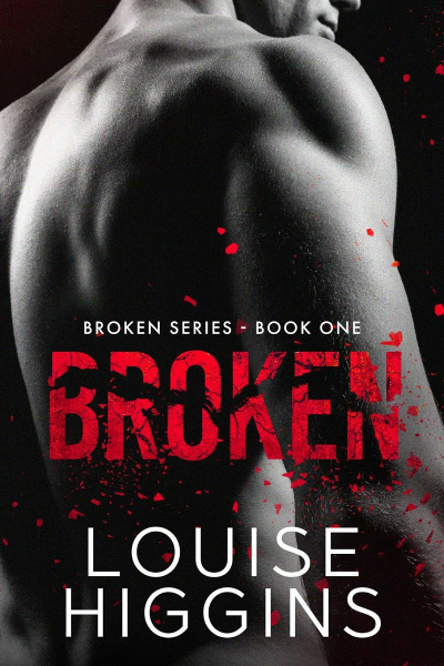
Example: Broken by Louise Dhondoo. What does my book cover communicate?

Colours – black, white, red are the dominant colours. What do they represent? Referring to the Big Eight Brand Colors wheel: black represents mystery and red passion, desire, love. The authors name is in white clear fonts which is eye catching and sets it apart from the image and title.
Image – Bare-chested hunky man. As stated previously, this is a staple of the romance genre, so this makes it clear that the story is romantic. A man on the cover, sells more books in the romantic genre than a woman, so it is a safe choice. The man has his back to the reader: he is turning away, does he have something to hide? Is there a secret or a lie? The black, white and grey imaging makes the story seem like a dark, heartbreaking, angsty tale.
Genre – The man on the cover and the red writing can be indictors of the Romance genre.
Conclusion
How much of what we see truly registers on a conscious level, when we are browsing a book store or rapidly flicking through the Kindle Storefront? What makes us pause on one book cover over another? Although many meanings are generic, there are also those unique emotional responses to images and colours that are drawn from personal experiences, we subconsciously feel and respond to when we see a book cover. An image can conjure, mean, invoke many different things to each person, even if it has some well-defined universal meaning and branding. Science has shown that we can take an image and understand all of the above in an instant.
Do we really understand what makes us stop at one particular cover rather than another when we have no real idea of the story inside, only what we deduce from the cover? Perhaps observe your emotional response to a book cover the next time you are browsing for something to read and think: what really is at work when we choose one story over another?